Friday, 18 May 2012

How can we make buildings resistant to earthquakes with earthquake engineering?


To be earthquake proof, buildings, structures and their foundations need to be built to be resistant to sideways loads. The lighter the building is, the less the loads. This is particularly so when the weight is higher up. Where possible the roof should be of light-weight material. If there are floors and walls and partitions, the lighter these are the better, too. If the sideways resistance is to be obtained from walls, these walls must go equally in both directions. They must be strong enough to take the loads. They must be tied in to any framing, and reinforced to take load in their weakest direction. They must not fall apart and must remain in place after the worst shock waves so as to retain strength for the after-shocks.

If the sideways resistance comes from diagonal bracing then it must also go equally all round in both directions. Where possible, it should be strong enough to accept load in tension as well as compression: the bolted or welded connections should resist more tension than the ultimate tension value of the brace (or well more than the design load) and it should not buckle with loads well above the design load. And the loads have got to go down to ground in a robust way. If the sideways load is to be resisted with moment resisting framing then great care has to be taken to ensure that the joints are stronger than the beams, and that the beams will fail before the columns, and that the columns cannot fail by spalling if in concrete. Again the rigid framing should go all around, and in both directions.

If the building earthquake resistance is to come from moment resisting frames, then special care should be taken with the foundation-to-first floor level. If the requirement is to have a taller clear height, and to have open holes in the walls, then the columns at this level may have to be much stronger than at higher levels; and the beams at the first floor, and the columns from ground to second floor, have to be able to resist the turning loads these columns deliver to the frame. Alternatively, and preferably, the columns can be given continuity at the feet. This can be done with 'fixed feet' with many bolts into large foundations, or by having a grillage of steel beams at the foundation level able to resist the column moments. Such steel grillage can also keep the foundations in place.

If the beams in the frame can bend and yield a little at their highest stressed points, without losing resistance, while the joints and the columns remain full strength, then a curious thing happens: the resonant frequency of the whole frame changes. If the building was vibrating in time with shock waves, this vibration will tend to be damped out. This phenomenon is known as 'plastic hingeing' and is easily demonstrated in steel beams, though a similar thing can happen with reinforced concrete beams as long as spalling is avoided.

All floors have to be connected to the framing in a robust and resilient way. They should never be able to shake loose and fall. Again all floors should be as light as possible. They should go all round each column and fix to every supporting beam or wall, in a way that cannot be shaken off. One way of reducing the vulnerability of big buildings is to isolate them from the floor using bearings or dampers, but this is a difficult and expensive process not suitable for low and medium rise buildings and low cost buildings (though it may be a good technique for Downtown Tokyo). Generally it is wise to build buildings that are not too high compared to their width in Earthquake areas, unless special precautions are taken.

Courtesy: reidsteel.com


Wednesday, 16 May 2012

The 90° Circle of View


The 90° circle of view framework is a very useful tool in creating a realistic perspective image by getting rid of unwanted perspective distortions. Sadly, there are more students who have no knowledge of it than those who know clearly what this is for and how to use it. I must admit I was one of the first: all I know was the vanishing point. He was my only friend. And whatever I do, I just can’t get rid of these distortions. It’s driving me nuts. I know there are more of you out there who does not know who this circle of view is, so I made this post hoping to help many of you out there. I wish you’ll start using this tool and start drawing better perspective images after reading this.


In the figure above, you can see that I used the same method I taught in this article about drawing a scaled one point perspective which makes use of measure bars instead of laying the plan above or underneath the image plane – which saves us a lot of time and sweat. Let us look at this picture as if it were a wide, wide surface covered with square tiles.


In this image, I removed the guidelines to give you a clearer picture of the tiles in one point perspective. You can notice that the tiles with any part of it, even just a little part of it that goes outside the circle of view, looks distorted and awkward. While those tiles lying inside the circle of view looks nice and perfectly square.


In this image, I erased all the parts that lie outside the circle of view so there are no more distortions visible. However, it’s very unusual for us architecture students, or painters to draw something with that kind of shape, – almost irregular. So what we must do is just crop the image so it fits inside our paper or the box inside our paper, so we can get a nice perspective picture.


Finally, we get the image we wanted and this is how it looks on our paper – a perfect image: no distortions, no awkward shapes.

Blog by: by Michael Tadeo on May 3, 2012
Courtesy: archidumdum.com


Monday, 14 May 2012

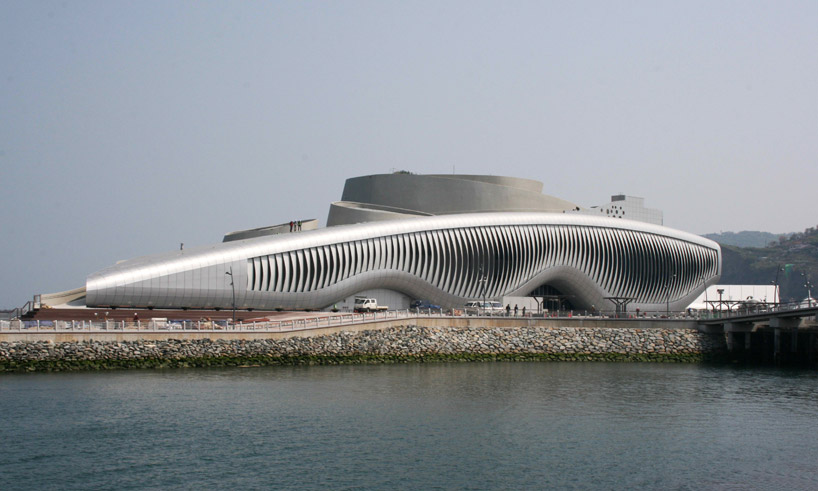
Soma: one ocean -Thematic Pavilion for yeosu expo 2012 complete


Opening in yeosu, South Korea on May 12; the EXPO 2012 thematic pavilion 'one ocean' by viennese practice soma is finally complete. After winning an open international competition in 2009, the proposal for the world exhibition developed into a reality,generating a multi-layered experience with a kinetic facade of fins which move in ocean-like patterns. spanning 140 meters,the elevation undulates from 3 to 13 meters in height. topographical lines along the roof translate into 108 vertical lamellas to control solar gain and then begin to open and close in a choreographed sequence after the sun sets. compressive forces are imposed upon the blades made of glass fiber reinforced polymers, a material high in tensile strength with low bending stiffness allowing for repeated and reversible elastic deformations. upper and lower motors generate a side rotation with a screw spindle driven by a computerized servomotor.
Positioned upon an industrial harbor, a permanent structure and waterfront promenade will serve as a tourist destination and permanent attraction for residents, derived from the ocean concept, morphing surfaces organize the spatial sequences.

upright surfaces create portals to welcome visitors into the exhibition area and transition into horizontal levels serving as a flexible stage for 'the best practice area', concrete structures in the forms of cones redefine the edge of the meandering coast, offering panoramic views of the nearby islands from roof top terraces, a public landscape of plateaus and paths unfold from the pavilion.


kinetic facade


view of the pavilion from the ocean


concrete cones

Courtesy: designboom.com


Wednesday, 9 May 2012

Creating from destruction: top restoration/renovation architecture


You don’t always need to destroy to build, sometimes you can rebuild or add to. The following buildings are examples of where the designers, owners or keepers have decided that the heritage of the site is more deserving than a a stark, new modern structure.


ROM, Toronto, Canada

Known as ‘The Crystal’ or the ‘Lee Chin Crystal’ (after its lead donor Michael Lee Chin) is the new entrance to the ROM (Royal Ontario Museum). Designed by Daniel Libeskind, completed in 2007. The aluminum and glass facade sits on a steel frame and wraps itself around the existing heritage structure of the ROM without actually touching it. A great example of deconstructivist architecture, and how careful consideration for what came before, plus an awareness for change can lead to a lovely symbiosis. [ROM]


Saustall Schaustall, Zurich, Switzerland

This is the kind of architecture that it’s easy to fall in love with! Architects of Stuttgart renovated with 18th Century pigsty, pulling it from the brink of crumbling into a fully habitable space. Superb work! Shortlisted for the 2005 AR Award for Emerging Architecture.


Bunker 599, Amsterdam, Holland

This is simply stunning. Not exactly what we would call comfortably habitable, but then it isn’t meant to be. Bunker 599 by Dutch practices Atelier de Lyon and Rietveld Landscape is an incision more than a renovation, destruction more than restoration. Used as a military defense from 1815 until 1940, has quite literally been sliced in 2 as part of a visitor attraction to the NDW (New Dutch Waterline). This is as stark as it is beautiful, and a great example of how change can be good, and how adaptation can breathe new life into old buildings! Via [DesignBoom].

Courtesy: habitables.wordpress.com


Monday, 7 May 2012

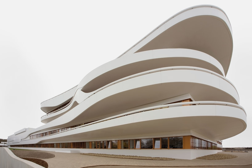
3deluxe: Kaffee Partner Headquarters


'Kaffee Partner Headquarters'

Image © Emanuel Raab


German practice 3deluxe has recently completed the 'Kaffee Partner Headquarters', a corporate complex for a coffee brewing machine company in Osnabrück, Germany. Stacked layers of ribbon cantilevers create an aesthetic centerpiece to a U-shaped building, doubling to define the main functional offices. The flowing contours derive from the brands values of vitality and lightness while the predominantly white color is accented with natural hues found in their product, coffee. Spanning 100 meters in length, the tripartite arrangement forms a 9,800 square meter structure. Strips within the facade branch from the focal element, connecting the adjacent wings with support services for customers and employees. The undulating profiles become a relief of linear strips which border copper-pigmented metallic window frames. Assembled from 150 uniquely formed prefabricated concrete parts, the cantilevers each weigh approximately 6 tons. Atop the seven stories of administrative areas, roof-top executive offices overlook the 10 hectare property surrounding the premises. Custom furnishings and fittings also within the lounges and cafeteria mimic the exterior with curved profiles.

Upward view of the cantilevered levels

Image © Emanuel Raab

Centrally located administrative building

Image © Emanuel Raab

Undulating ribbon cantilevers

Image © Emanuel Raab


Image © Sascha Jahnke

Ribbons transition into a linear elevation of the customer support wing

Image © Sascha Jahnke


Image © Emanuel Raab

Reception

Image © Emanuel Raab

Employee lounge

Image © Emanuel Raab

Custom made furniture with coffee beans inside


Image © Emanuel Raab


Courtesy: DesignBoom.com

Wednesday, 2 May 2012

Presentation tips for Architects, Part I


A good presentation could get your project approved, or quickly dismissed if you don’t plan it right. For example, a presentation to a client compared to a presentation for a group of architects is very different, even if the project you need to communicate is the same.

As I usually have to give at least a couple presentations per month, I have always tried to make them worth and not waste other people’s time. A big help for that has been Garr Reynolds, the “Presentation Zen” from which I haven taken some key points of which I will share with you in order to make a good presentation, adapted to our profession.

1.Know you audience:
I think that this is the most crucial part no matter what you need to communicate. In order to deliver your message you need to present it according to whom you want to understand it. There are several terms and concepts that we as architects can easily understand, but that our clients or a general audience might not understand at first. Often we even invent or misuse words, misleading our audience. Program, urban fabric, etc.

2.Keep it simple:
The same as we do with our projects, a presentation should be simple. We should strip out anything that is unnecessary. Think of it as a Mies building on which everything is there for a reason and nothing can be removed. This is often the most difficult part, as we have to reduce it to its essentials. As an exercise Garr suggest that you outline the three things you want your audience to remember from your presentation. “Less is more”.

3. Relevance:
Related to the previous point (and also to the 1st). Put yourself in the shoes of your audiences and ask “so what?” You might have several interesting stories or concepts to tell the audience, but if they don’t add to what you want to communicate – just take them out.

4. Structure:
You start with the foundation, follow with the structure, then move on to the skin and the interiors. This is a crystal clear process that you already know. Do the same for your presentation.

It also makes your audience follow you and focus on the presentation. When I have to make a long presentation I always start with an index, and as we move forward I keep reminding the audiences where we are in the presentation, therefore they can follow along, stay focused, and recall what comes next.

5. The elevator pitch:
Say the speaker before you exceeded on their time, or the client was late and is short on time. You always need to have a short version of the presentation, or at least know which parts you can skip in order to make it on time.
The exercise is usually called “the elevator pitch”, under the idea that you should be able to sell your idea in the time span of an elevator ride, meaning in a maximum of 30 seconds and in 130 words or fewer.

6. Storytelling:
Regarding the previous point, it reminded me of Frank Lloyd Wright drafting the Fallingwater House only 2 hours before his meeting with Kaufmann, all that in one sitting at his drafting table. As you can see, this story was appealing to you as an architect, and you immediately understood my point. Stories can connect you with your audience, and engage them. You can think about your project as a story, and develop the whole presentation as if you are the story teller. Just keep in mind the previous points, as an irrelevant story can do more harm than help.

7. Confidence:
Even after almost a hundred presentations, I’m still nervous before giving them. If you are nervous, your audience will notice it, and will focus on that instead of your project.

Mies may have suggested a glass of scotch, but the best is to rehearse, rehearse and rehearse. If you know your presentation backwards and forwards it will flow naturally, and will also keep you prepared for any unexpected event during the presentation.
And “picture the audience nude” always comes handy. I hope these tips can help you with your future presentations. 

By David Basulto
Courtesy: ArchDaily.com

Friday, 27 April 2012

Little Known Ways to Make Snappier Elevations


Elevations dictate the impression we leave on people who see our work. Perhaps it comes next to clever planning with regards to hierarchy of importance. Though I would say these two must be coordinated during the planning phase, reality says most of the time, floor plans are given much more importance. As the saying goes: “when the planning gets tough, the tough drinks coffee and keeps sketching all night”. But how about the time huh? So I say, in times like this, when all we can make are “not so good, not so bad” plans, we turn to elevations – we make them look snappy, they pull us up by hiding minor flaws. Though the design really depends on you on how you mix and match patterns and shapes and themes, some of these tips may help.

1. Look around

I remember a quote I happened to read a long time ago while surfing the web and it says: “architecture is the art of plagiarism”. At some point I agree with this. It is all about mixing and matching designs you see around you. You may get your concept from a fruit, a car, a tree but when looking for immediate patterns, you can look at other buildings too. See what features you can get from it and mix it up with other designs you can see from other structures. Columns, ceiling designs, etc.

2. Use line weights

This one was really taught by my instructor really but I put it into practice after I have read it in an old book with a title I can hardly remember, it was like “Architectural Drafting and Design”. Actually there are four ways to use line weights but my two best bets are the shadow, and outline. In shadow, you use heavier lines on the parts where shadows are set to originate. And in outline, you use heavier lines on the.. outline (duh!) It gives emphasis to the structure and makes it look a lot better.

3. Gather some patience and add shadows

I’m not referring to shady shady stuff we do using pencils when were almost finished, bored and have nothing left to do. What I mean here are shadows that would really show where the light source is, and where shadows really are supposed to be cast. It adds a sense of depth and gives a hint whether the surface is protruded, round, empty, slanted, etc. It gives a 3-dimensional feel to the elevation which is actually drawn as 2 dimensional. Though it really eat up some time, it’s really worth it.

4. Do not use colors you cannot handle

This is the common mistake I see in many plates, they’ve got a good floor plan, great perspective, great elevation, but annoying color combinations. The “could have been” classy building looked like a dirty bitch. You get what I mean? Color is critical. It affects the mood of the people who sees it, and of course affects the overall look and feel of the building. So better settle with calm tone and easy to match colors like, white, brown, or better stick with monochrome.

Courtesy: Blogger at Archidumdum.com