Friday, 29 July 2011

Nestlé’s Chocolate Museum / Metro Arquitetos Associados


Introduction

The intention in designing the structures of the public visiting of the Nestlé chocolate factory is to make a generic landscape of the highway that link Sao Paulo and Rio de Janeiro, the biggest Brazilian cities, revealing the presence of an area of visitation. This visibility is done by building towers to access the new route, in glass and steel, which in addition to the strong brand exhibition resolve the conflicting currents between production and visitation. The structural geometry and the materials used are designed to provoke a sensory and perceptual experience, and contribute to the seizure of information about the history and production of chocolate spread along the route.


The project is an intervention inside the Nestlé chocolate factory. Built in the 60’s, the tour was designed to receive external audience, but in a precarious manner and without museum character. The intervention resolved three main issues: conflict of flows between the external and public workers, make simple path through a museum with interactive content and, finally, to demarcate the existing building with strong character. We created two towers and walkways outside the factory, access a [lower] and another in the output [in front of the largest and Dutra], both composed by a set of stairs and elevator.


The metal structure of the towers and walkways is composed of tubular 100mm diameter, with variations in the thickness of the inner walls provided with that same detail of setting vedos either laminated glass panes with red film [south face], sometimes steel sheet brise expanded type [north side]. The floors are in perforated steel plate and contribute to natural ventilation and drainage. The roofs are in flat sheet steel top and bottom with EPS in the core for better acoustic and thermal performance.


The structure is composed of triangular modules non-coplanar 2.5m that are repeated every 10m. This configuration also aids in structural bracing and thus allow a more slender means that the plans reflect different glass figures of the landscape. The spans of the ‘bridge 1’ is 10 meters [supported on metal pillars and beams session variable] and the space between the ‘tower’ 1 and manufactures, 27.5meters. Already on the catwalk II, the gap between the tower and the pillar is 15m, and the balance to the mill is 5m. Inside the track, 10 core themes were designed according to the plant’s production, from raw materials, through the different stages of production to the final stage of packaging. Circular windows were opened at strategic points. Each core has colors, materials and character as distinctive soundtrack, narration and special scenery.

Wednesday, 27 July 2011

FAKE POOL YOU CAN WALK INTO

Leandro Erlich’s installation “Swimming Pool” at MOMA PS1, New York City.


Thursday, 21 July 2011

Study Architecture | Challenging And Fun


Architects are inventors, innovators, trendsetters… Their job is to create good living and working environments. Throughout the ages, Architects have proven themselves to be no less in stature than great artists, painters or sculptures of ancient times, for their creations still remind us of the great inventiveness and creativity these individuals had. Leonardo Da Vinci was one of them. So was Frank O. Gehry, Frank Lloyd Wright and many others like them who have left their mark on the sands of history by their novel and innovative ideas.


Life of an Architectural student can be tough at times. Students who chose this line of career are bustling with enthusiasm. When they join an Architectural Institute, their hearts are filled with anticipation of all the fun things they’ll do. These students have the urge to demonstrate their creative genius, to redesign the world according to their ideals, to prove their worth to the world.
But in reality, Architecture is a very difficult field of study. Creativity does count, but you do not have the leisure to wait for that inspiration to come to you.  College assignments and projects will ensure you’ll have to spend more time doing clerical work than creative thinking. There are sharp deadlines when your assignments have to be submitted. You have little time to think about your work. In the end, you’ll find yourself juggling between multiple unrelated subjects, multi-tasking between your assignments to complete them before the deadline. There are but few opportunities to exhibit your talents.
A student has many choices to make… architecture being such a vast and varied field. It comprises of not just the art of designing the buildings and their surrounding environment, but we also have to deal with history, geology, engineering, climatology… and a host of other subjects. Artistic students may prefer Architectural Design over Electrical Systems. A more technical oriented student may immerse himself in studying Structural Engineering rather than wasting his time learning about the ancient History of Architecture which is no longer relevant in today’s society. There are so many different options.
It is a tough choice to make. An architect may not only plan buildings and design their elevations, but may also designing the landscape. It would be a part of Landscape Architecture. Some purists try to blend the original landscape itself into the building, in such a way that the building seems like a natural growth and not an artificial construction. Then there is Interior Designing, which is a very important and specialized branch of Architecture. A student may decide to major in any of those fields. Architecture is fun… it is exhaustive, but the pleasure you get from seeing your ideas coming to life is exalting.
Nothing can top Professional Architects and students of architecture from letting their dreams run wild and them trying to achieve the impossible. Its always a pleasure to know that there are people who are really pushing the limits of what we think as possible. They may be called heretics or insane, but they are the real builders of a nation. The Visionaries… who have the art and the craft of astounding the masses with their brilliant designs…
Architecture is Tough… Architecture is Challenging… Architecture is Fun… :)

Monday, 18 July 2011

9 Architectural Photography Tips


Classical or contemporary; architectural photography can be as challenging as it is rewarding. Here are some pointers to help you get started…


1. Be sensitive to the direction of light as this can increase contrast, shadows, textures and reflections. High levels of contrast can fool cameras into exposing the scene incorrectly, but shooters can easily overcome this by applying exposure compensation. Another trick is to bracket shots at different exposure values (exposing one for the highlights, one for the midtones and one for the shadows) and later merge them in a dedicated HDR program (such as Photomatix).

2. A fish eye or wide-angle lens (and focal length) is ideal for this genre as it enables photographers to frame the entire building within its environment. However sometimes your glass may not be able to encompass the whole scene, which is where the helpful panoramic format can come in handy. Many compacts now offer a specific Scene mode for stitching together several shots in camera, but the same effect can be achieved post-shoot with dedicated panoramic software such as; as Hugin or PTgui if you are shooting with a DSLR.

3. We are told it’s what’s on the inside that counts and sure enough architecture photography isn’t restricted to the facia of a building. It can be difficult to correctly white balance an interior setting, especially ones that are reliant on various forms of artificial lighting, so remember to compensate accordingly in the White Balance menu or take a reading from a grey card. Interior shots in older buildings tend to be more irksome because they traditionally feature small windows and doors – thus lack natural light. Try using a tripod and executing a long-exposure and remember you could always utilise an ND filter to stop highlights being blown out when shooting in the day. Alternatively you could use supplementary lighting, such as a diffused flash but be careful as this may rob the scene of its atmosphere and detail.

4. When the sun goes down a new form of architectural photographer can surface. To shoot a structure as a silhouette during sunset, position the architecture between yourself and the sun. Make sure the flash is deactivated and expose for the sky. If the foreground is too light set the exposure compensation to a negative value to darken it. This effect can produce particularly enigmatic results. Night shots can be very dramatic and atmospheric too, but remember to take them when there is still some light and colour left in the sky as this adds tone to the backdrop and help to illuminate details. As before get into a good position and set your camera on a tripod and wait for the dazzling display of urban lights from windows, street lights, signs – all of these in their rainbow of neon colours will add to the ambience. Use a wide aperture and long exposure, and if your camera is supported you’ll be able to employ a low ISO to ensure details aren’t depreciated by noise.


5. Unlike other forms of photography, exciting architectural images can be produced in all weathers. A church on a clear day may strike the viewer as pleasant but maybe a bit bland, revisit it when there’s a storm brewing overhead or a mist rising from the damp earth and the results can be altogether more intriguing. By revisiting and shooting the same building in these various weather conditions, photographer’s can produce a neat portfolio of shots – maybe select the best three and you’ll have yourself an interest triptych.

6. Reflections add an extra dimension to architectural images and allow the photographer to create a canvas on which the building can be playfully distorted. Urban environments are littered with a multitude of reflective surfaces, so you’ll never have to look too far to practice, for example: windows, water features, puddles and wet streets, sunglasses, rivers and modern art.


7. Research the reason why the architecture exists – you’ll be surprised how a little bit of background information can fuel a great deal of inspiration. Ask a guide to point out small yet interesting aspects that perhaps go unnoticed by the general public. Buildings of architectural merit usually include focal points so try cropping in close on these for frame-filling abstracts. Furthermore you may want to include repeated artefacts that are littered across the exterior, for example; intricate brickwork or chequer board windows. Use a telephoto lens to zoom in close and don’t forget a tripod to support those longer focal lengths.

8. The average building is far taller than the tallest photographer so there will inevitably be some element of distortion in an architectural photo, but this can be employed to create a source of tension within the frame. Simply position yourself as near to the base of the building as possible and shoot straight up. If playing with perspective isn’t for you then stand further back and add a sense of scale to your image by incorporating everyday objects such as people, trees, transport and benches, etc. To retain detail throughout the scene plump for a small aperture (large f stop) such as f14, alternatively try throwing out the sharpness of either the foreground or background by choosing a large aperture (small f stop).


9. Architectural images shouldn’t just be aesthetic and graphic; they should also provide dynamism and movement – so play with the lines, the light and the shadows to provide interest and consider the hierarchy of levels and areas. Architecture is built on the principle of symmetry, so capturing this symmetry will ultimately reinforce the subject matter and hopefully strengthen the composition. Discover the centre of the symmetry by placing your hand between your eye-line and construct your frame around this centre. Alternatively break free of the cold and sterile straight lines and rectilinear angles and follow the principles of nature by including curves and circles in the form of shadows or reflections can help to soften the structure.


Wednesday, 13 July 2011

House in Fuji


The house is surrounded by attractive scenery with a park nearby and distant views of the snow-capped Mt Fuji, designed each section to be connected with the outside environment. On the south side of the building, the roof slab was extended, creating an eave to protect residents from direct daylight in summer months. On the north side, areas were cut from the volume to allow daylight the daylight to enter the space.


On the third floor, an open terrace was designed, which is where the best views of the nearby park and Mt. Fuji can be seen. On the 2nd floor, there are wooden louvers that run along the shape of building, providing privacy for residents. The first floor has an additional terrace area that is used as a golf practice area.


The tilted wall of the north side provides privacy from the slope side and creates depth in the main bedroom. On the second floor, in the living room, dining room and kitchen, we can feel the tilted wall of north-south greatly. Because concrete tends to look inorganic, the facade of the south side is covered with the wooden louver to soften it. The design frames Mt Fuji, a view the residents have become accustomed to, in a dynamic way, incorporating it into daily life.


Tuesday, 12 July 2011

Top 10 Architectural Wonders of the World

We know about natural wonders of the world like the Grand Canyon, Mount Everest, Niagara Falls and so on...But why not we think about the Man - Made Wonders. Lets talk about the absolute must-see buildings. The ones that will make your jaw drop and will have you asking, "how did they do that!?"
Here is a list of "Top 10 Architectural Wonders Of The World"

10. Empire State Building, New York City, NY
This art deco skyscraper stood as the world's tallest building for more than forty years and now it's 12th. The empire state building is one of the world’s most recognizable skyscrapers. Empire state building is one of the popular attraction in New York city. The tower has 102 storeys and was built in the 30s. There are two observatories, one is on the 86th floor, where you can see a breath-taking 360-degree view of the city. There is also a much smaller observation deck on the 102nd floor.

9. Kogod Courtyard, Washington D.C.
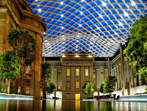
The courtyard was designed to make visitors feel like they’re outside, without having to deal with cold and rain. Thus, a roof was necessary to making the space truly useful, and the architects decided upon a wavy glass and steel structure, with glass panels set in a grid and supported by columns. There are several pools of water, which are only a quarter inch deep. They reflect the courtyard and can also be turned off to accommodate more people in the space. Adorning the courtyard are two 32-foot ficus trees and 16 black olive trees, which are filled in with a variety of shrubs and ferns. The space is 28,000 square feet, and will feature free wireless internet access. it was Designed by Norman Foster, this elegant glass canopy was built as an addition to the museum and houses part of the Smithsonian's art gallery. It won the prestigious Pritzker Architecture Prize in 1999. It's over 28,000 square feet of glass and gives the impression of a floating ceiling.

8. Panama Canal, Panama
Panama canal is a man-made canal was. It remains as one of the most difficult and impressive engineering feats of our time. Panama Canal links the Pacific and Atlantic oceans. Tt was built as a travel port and has had an enormous impact on shipping between the east and west. Each year over 14,000 vessels pass through its concrete tunneled walls. The canal has been enormously successful, and continues to be a key conduit for international maritime trade. The canal can accommodate vessels from small private yachts up to large commercial vessels.

7. Red Ribbon, Qinhuangdao, China
In Qinhuangdao, China the Tanghe River Park features a new installation of a red steel bench that runs for half a kilometre through the park. The Red Ribbon project is th winner of American Society of Landscape Architects award and was also selected by readers of Conde Nast Traveller magazine as one of the seven new wonders of the architecture world. This knee-high red steel bench acts as a viewing place for the area's lush vegetation and diverse species. The challenge of this project is to protect the good ecological condition of the site and to ensure safety hygiene accessiblity and attractiveness, allowing people touse the site as an urban park. This "red ribbon" provides seating, environmental interpretation, lighting and displaying of native plants.

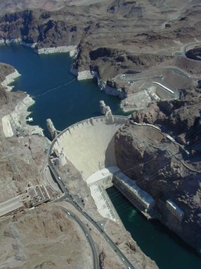
6. Hoover Dam, Border of Arizona and Nevada
Hoover Dam, originally known as Boulder Dam, is a concrete arch-gravity dam in the Black Canyon of the Colorado River, on the border between the U.S. states of Arizona and Nevada. Hoover Dam is one of the world's largest hydro-electric generating stations. Hoover Dam is one of the most jaw-dropping sites in the US. The dam is named after America's 31st president, Herbert Hoover, who played a large role in bringing the nearby states into agreement about water allocations, settling a 25-year controversy. One more great thing about this dam is it was completed ahead of schedule. Construction began in 1931 and finished in 1936. Two years ahead of schedule and well under budget.

5. The Channel Tunnel aka The Chunnel, Europe
The Channel Tunnel, also known as the Chunnel,is a 50.5-kilometre undersea rail tunnel linking Folkestone, Kent in England with Coquelles, near Calais in northern France beneath the English Channel at the Strait of Dover. The Channel actually consists of three tunnels bored in the rock below the seabed of the Channel. Two of the tubes are full sized and accommodate rail traffic. In between the two train tunnels is a smaller service tunnel that serves as an emergency escape route. There are also several cross-over passages that allow trains to switch from one track to another.Today, trains roar through the tunnel at speeds up to 100 miles per hour and it's possible to get from one end to the other in only 20 minutes!

4. CN Tower, Toronto, Ontario, Canada
The CN Tower is the world's tallest building as well as Canada's most recognizable icon. The tower is the centre of tourism in Toronto. From the top of the tower you can view the breathtaking view of downtown Toronto. Things to do in the tower include walking on glass floor, eating over 1000 ft above ground at the revolving 360 Restaurant, watching a movie about the construction of the CN tower and of course enjoying the view. It is also a centre for telecommunications in Toronto.

3.The Guggenheim Museum Bilbao, Basque Country, Spain

The Guggenheim Museum Bilbao is a museum of modern and contemporary art. It was designed by Canadian-American architect Frank Gehry and built by Ferrovial. The museum is located in Bilbao, Basque Country, Spain. It is built alongside the Nervion River, which runs through the city of Bilbao to the Atlantic Coast. The exhibitions in the museum itself change often, the museum hosts thematic exhibitions, centered for example on Chinese or Russian art. The museum features permanent and visiting exhibits of works by Spanish and international artists. The circular body is signature to the architect and was built to showcase the museum's pieces in a unique way. It stands alongside Spain's magnificent Nervion River.

2. Golden Gate Bridge, San Francisco, CA

Arching over the Pacific ocean, the Golden Gate Bridge links San Francisco to Marin County . The Golden Gate Bridge is acclaimed as one of the world's most beautiful bridges and with its tremendous towers, sweeping main cables and great span, it is a sensory beauty featuring color, sound, and light. The Bridge can be a very busy place, particularly during the summer months. Pedestrians can walk the bridge to get sprawling views of San Francisco's harbor. Historically, it's also one of the most photographed bridges in the world.

1. Burj Dubai, United Arab Emirates

Burj Dubai is a supertall skyscraper under construction in Dubai, United Arab Emirates. It is the tallest man-made structure ever built. Construction began on 21 September 2004, and the tower is expected to be completed and ready for occupancy by September 2009. This structure will be the world's tallest building once it's completed. Although the height has been a well-kept secret, experts predict it will be over 2200 feet and tower plans suggest an outdoor swimming pool will be located on the 78th floor and the 124th floor will be an observation deck. It will also, reportedly, contain the world's fastest elevator.


Amazing Living Architecture – Root Bridges of Cherrapunji

You may be mistaken for thinking that these are photos taken from the set of one the Lord of the Rings movies but in actual fact these are real examples of living architecture. The bridges you see are from Cherrapunji, India which is one of the wettest places on Earth and are actually made by tree roots. These bridges are very much alive!


The Khasis use a technique of slicing and hollowing the roots to help guide them and eventually when they reach the other side of the river they take root back in the soil. The bridges can take up to 10-15 years before they are fully functional and because the bridges are still alive they grow ever stronger each year. Some of the bridges are reported to be over 500 years old and can support the weight over 50 people.


This special bridge is known as the “Umshiang” Double Decker Root Bridge”.


Tuesday, 5 July 2011

Tree (in) House: Eccentric Elevated Los Angeles Hill Home


There are some houses that have real trees growing inside or straight up through them – which sounds wonderful, until you consider the problematic fact that a living tree tends to keep growing. This home design takes that cool ‘tree-in-house’ concept and applies it with a series of creative twists, raised up high and visible from the distant downtown of LA.


In architectural terms, the steel supports that shoot up through the raised dwelling at odd angles are a clever abstraction of the natural forest growing around this design by RPA. However, there is also the quite direct and literal engagement with surrounding trees in terms of both the placement and elevation of the building.


Small, cozy and complete with an outdoor shower, this truly seems like it must sit much further from the bustling paved mega-metropolis of the West Coast. A few key design moves serve to further reinforce the connection of nature and architecture – outside and interior are joined visually, for example, via a dizzying in-floor, clear-glass inset that allows views down a branch of the tree that runs around and below the dwelling.


The sharp division of light and lofted living space and tied-to-the-ground construction is enhanced by the use of thin steel and light wood for the house itself and heavy gray concrete for the steps and platforms that lead up to it. While a house with a tree in it (or house up in an actual tree) provides one way to feel like you are living above it all, a home like this one manages to create a comparable effect with a more modern feel (and durable design).


Monday, 4 July 2011

Ontario Eco House Operates Off the Grid

This eco house in the Muskoka Lakes area of northern Ontario is the perfect peaceful getaway with style to boot! Designed by Canadian architects Altius Architecture, the 3,200-sq.-ft. stone house blends beautifully with the rocky Canadian Shield backdrop. And in the foreground, this lake house boasts breathtaking views in every direction. Inside, the home’s natural wood floors and ceilings are warm and homey, exuding quality and timeless style. Floor-to-ceiling glass walls frame the pristine panoramas. A central “void” serves as an anchor for the various living areas that radiate off it, and passively circulates light and air. On that note, this eco house operates off the grid, thanks to elements like its orientation to naturally heat and cool the home, solar hot water and photovoltaic solar panels, as well as the incorporation of clean-burning fireplaces, concrete walls and a high-performance envelope, thermal glass, and a green roof that helps keep it cool during the hot months and insulated during the harsh winters